Back in the '90's, my medium of choice was color pencil over pen & ink (sometimes using pastels for the background). Line work was minimal, layered color pencils gave the drawings depth. This was a departure from what I was doing previously, lots and lots of line work and cross-hatching (I am looking at you Frank Miller's Ronin), regardless of whether it was pencil or ink.
Back in that day, the drawings were small, less than 8.5 x 11. The two below were 11x17, a real stretch for me. Covering that much paper with color pencil took time. That is when I started experimenting with adding pastel (see the blue mountains). Now I am mostly playing around with water color, pushing color around. Very little in the way of drawing. Sometimes it is fun to look back and see how my "style" has evolved.
Unfortunately, this was long and before there were inexpensive scanners or digital cameras so I have few digital records of these drawings. Most of those pictures are long gone, given away to anyone who asked. But a few remain.
I give you Herk the Barbarian and Silv. . .
Color pencil, pen & ink, and pastel on bristol 11 x 17 (board circa 1994)
Color pencil, pen & ink on bristol board 11x17 (circa 1993)
Showing posts with label pastels. Show all posts
Wednesday, April 26, 2017
Wednesday, January 27, 2016
A Bear of Very Little Brain
I am calling this a stick drawing. Why a stick drawing? Well, this is the first painting I have done using my new Daniel Smith watercolor sticks and pastels (which are, well, sticks). The watercolor sticks are, essentially, watercolor rolled into a stick. . .how cool is that? It allows you to draw with watercolor. I did the under painting with the sticks and then went it dried, I added more details with Sennelier pastels. . .and wa-lah. . . A Bear of Very Little Brain appears.
Daniel Smith watercolor sticks and Sennelier pastels on 140 lbs paper 9x12
Friday, December 18, 2015
Rocks at Dawn Revisited
I never really liked this painting when I finished it. I was still using cotman watercolors and had not come close to understand how to use them. The plan was always to either go back or try this picture again. Well, I decided to touch up the painting with my beloved Unison pastels. I did not do too much (further defined the rocks by adding yellow highlights and dark purple and brown shadows and making the clouds more wispy with a light blue plus the bit of angry clouds in the upper right).
All in all, I like it better.
Watercolor & pastel on 200 lbs watercolor paper, 16x12
All in all, I like it better.
Watercolor & pastel on 200 lbs watercolor paper, 16x12
Sunday, February 09, 2014
To Make an End is to Make a Beginning -- The Return of Pastels
Pastel painting is my true passion. While I am enjoying watercolor immensely, working in pastels is where I feel most expressive. Hard to believe it has been nearly a decade since I have painted a landscape in pastels and 2 years since this.
This is another Key West sunset, taken while on a Wine and Wind sailing tour. It was a great time and a perfect end to a wonderful day. I had debated about trying this sky in watercolor, but ultimately I felt I could do it more justice in pastels. Plus, my beautiful Unison pastels have sat neglected long enough.
What we call the beginning is often the end
And to make an end is to make a beginning.
The end is where we start from.
TS Eliot
Little Gidding
Pastel on paper mounted on board 16x20
The room set up and photo reference. Since I have flattened my high school easel for my watercolor work, I am using a table top easel for the pastels. I like this new set up as it allows me to paint in watercolor or pastels, without wasting time finding my tools. If you look closely, you will notice the sky in the photo is different from the final, I felt the color gradation was too jarring and needed to be softened.
A detailed close up of the setting sun. I blended some of the colors in the clouds to give them a more atmospheric look while left the strokes in the water rougher to show motion. Notice how the grain of the pastel paper peaks thru in some areas, but not in others.
This is another Key West sunset, taken while on a Wine and Wind sailing tour. It was a great time and a perfect end to a wonderful day. I had debated about trying this sky in watercolor, but ultimately I felt I could do it more justice in pastels. Plus, my beautiful Unison pastels have sat neglected long enough.
What we call the beginning is often the end
And to make an end is to make a beginning.
The end is where we start from.
TS Eliot
Little Gidding
The room set up and photo reference. Since I have flattened my high school easel for my watercolor work, I am using a table top easel for the pastels. I like this new set up as it allows me to paint in watercolor or pastels, without wasting time finding my tools. If you look closely, you will notice the sky in the photo is different from the final, I felt the color gradation was too jarring and needed to be softened.
A detailed close up of the setting sun. I blended some of the colors in the clouds to give them a more atmospheric look while left the strokes in the water rougher to show motion. Notice how the grain of the pastel paper peaks thru in some areas, but not in others.
Wednesday, November 27, 2013
Yet Another Autumn Tree -- In Pastel and Watercolor
It might not seem it from this blog recently, but pastels are my favorite medium. Sometime ago they surpassed even simple pencil or pen and ink as the medium I love most. The portability of watercolors have allowed me to paint where ever I go, and as such, I have become much more prolific this year. That said, I am still stumbling my way thru the medium, with as many wrong turns as successes. And as I stated in last weeks painting, I want to do more pastels and watercolors. I just need to continue to be bold.
Watercolor and Pastels on 140lbs watercolor block 12x16
Here is the same painting with just the watercolor underpainting. As you can see, it is substantially different from the final painting. It is not a bad effort, but I felt it was missing something. So I added a robust foliage in bright red and orange pastels. It is debatable whether I improved it, but I did enjoy the process.
Watercolor on 140lbs watercolor block 12x16
Watercolor and Pastels on 140lbs watercolor block 12x16
Here is the same painting with just the watercolor underpainting. As you can see, it is substantially different from the final painting. It is not a bad effort, but I felt it was missing something. So I added a robust foliage in bright red and orange pastels. It is debatable whether I improved it, but I did enjoy the process.
Watercolor on 140lbs watercolor block 12x16
Labels:
Fall,
pastels,
Pocket Palette,
trees,
watercolor
Wednesday, November 13, 2013
Transitions
One of my biggest goals regarding my art is to be able to incorporate both watercolor and pastels into a single unified look. Previous attempts have been equivocal, mostly because I would not completely commit to the process or I would decide, "Hey, that watercolor is fine the way it is" and not add pastels. But this time, I decided to be bold and, as the corporate jingle goes, just do it. I like these results much better.
Watercolor and Pastels on 140lbs watercolor paper 9x12
Below is the watercolor without pastels laid over the top. Like many of my watercolors, it lacked any compelling contrast; everything is a mid tone. The addition of the pastels added more interest; darker clouds and bolder mountains.
Watercolor and Pastels on 140lbs watercolor paper 9x12
Below is the watercolor without pastels laid over the top. Like many of my watercolors, it lacked any compelling contrast; everything is a mid tone. The addition of the pastels added more interest; darker clouds and bolder mountains.
Thursday, April 18, 2013
Crossing the Ford
My field notebook has alternating pages of 140 lbs watercolor paper and regular drawing paper. Thus far I have only used the watercolor paper. I decided to work fast on the other sheets. Just a rough sketch; focusing more on the energy of the riders plunging across the river. I used pastel to connote the spray of water.
Watercolor on drawing paper 10x7
Saturday, April 13, 2013
The Simple Farmstead
I did not have a firm idea of what I wanted to do with this one, other than I wanted to show a field of yellow flowers. I could have used the masque pen to keep areas clean for the yellow water color, but instead I chose to paint the field green and use pastels to add the flowers. I blotted the pastel with watercolor to give it a more blended look.
It is simple, but I think it works.
Pastel over Watercolor on 120lbs paper 9x12
It is simple, but I think it works.
Pastel over Watercolor on 120lbs paper 9x12
Wednesday, April 03, 2013
Sky Study
Watercolor and pastels. . .I have seen it done and have always wanted to do it but I have never been able to pull the trigger. I get to the point in a watercolor painting where I want to add pastels, really add pastels and I cannot.
Pastel over Watercolor on 140lbs paper 6x4
I did this quick sky study with the express intent of going crazy with pastel over the top of the watercolor. This was a liberating experience. I rather liked it.
Pastel over Watercolor on 140lbs paper 6x4
I did this quick sky study with the express intent of going crazy with pastel over the top of the watercolor. This was a liberating experience. I rather liked it.
Saturday, March 02, 2013
Keeneland -- A True Painting
This was painted with no crutches, no pen and ink to delineate different areas or the use of visible pencil lines to show detail. This is 100% watercolor, with a bit of pastel added at the end to enhance certain areas of the sky and grass (which I do not consider a crutch). I think I was able to nail the musculature of the hind limbs with washes and a thin brush for detail.
Watercolor on 140lbs paper 9x12
For those who know me, know that horse were a central part of my life for almost a decade. I do not work with them any more, but sometimes people contact me about my old work. Back in April of last year I had the opportunity to visit Kentucky and took in some races at Keeneland. This is the photo from the back of the racing program. I took many of my own at the several farms that I visited during that trip. A handful of those are in the queue waiting to be painted.
Thus ends the streak of the Three Legged Horses. Thanks Cone.
Tuesday, June 19, 2012
Hulk vs Rhino
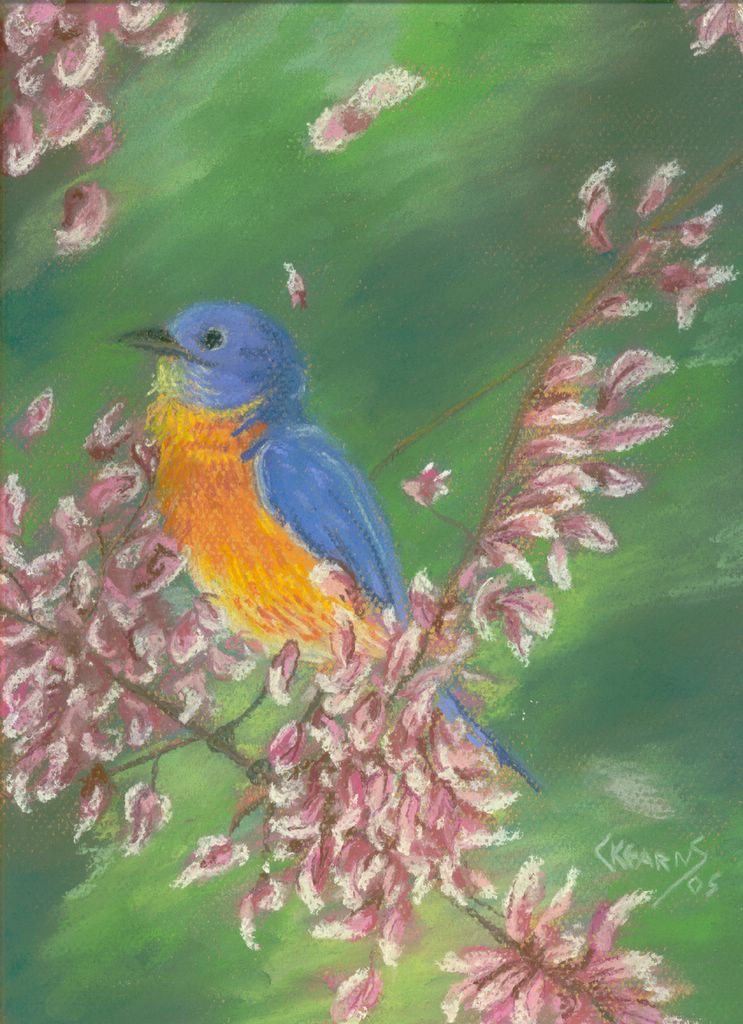
So, I finally finished a pastel painting! I had not realized, but looking back, the last pastel painting I did was in 2005. It was the Song Bird in Blue. How did that happen? I have no idea but I am happy the long drought is over. As with most things, this took longer than I had expected but I think it turned out well. I am very happy with the final product.
This picture, which is a replication of the cover from Hulk #104 (June 1968), was my favorite comic book issues growing up. I must have read this book hundreds of times until it was a battered, beat up mess. I just loved the fight between the Hulk and the Rhino and how the Rhino, despite being severely over matched never gave up. The Hulks ends up dragging the Rhino away from a burning jet liner that is about to explode. Just a spectacular issue. Growing up, I had always thought the issue and cover were drawn by Herb Trimpe (an underrated and under appreciated artist who had a great run on the Hulk). However, when I went searching for a reference picture to paint I discovered it was drawn by amazing Marie Severin. She was the Hulk artist as the book transitioned from Tales to Astonish to Hulk proper (with issue #102).
Monday, May 28, 2012
Color Blocking the Hulk
Color blocking is the next step in my process. So, after the rough charcoal sketch, I begin to lay down color. At this point, it does not matter if I get the exact color or not, I am just trying to block in the basic colors. The painting will be worked and re-worked with workable fix, allowing for layer upon layer of color (without the painting become a muddled mess). The directions of pastel strokes are varied and there is no blending. I am even testing colors for the Hulk's skin tone, seeing how they look upon the pastel board.
The process continued as I laid down color on the figure of the Hulk. At this point, I did not completely obliterate the charcoal under drawing so I could still see basic musculature. The color of the foreground looks more orange than yellow of the above picture. I guess I will have to be more consistent with light and flash when I take these photos.
Next, I began to blend the colors, to smooth out the rough pastel strokes. I also switched from the harder Rembrandt to the softer Unison pastels. From here on out, most of the work will be done with the Unison sticks. I have some pastel pencils that I hope will allow me to do fine detail (on top of a layer of workable fix). This is something I have never tried before as it was not necessary for the landscapes I had painted previously. I am curious to see if I can pull this off.
When it stops raining, I will take this out side and hit it with the workable fix. I hope to begin layering the details soon.
The process continued as I laid down color on the figure of the Hulk. At this point, I did not completely obliterate the charcoal under drawing so I could still see basic musculature. The color of the foreground looks more orange than yellow of the above picture. I guess I will have to be more consistent with light and flash when I take these photos.
Next, I began to blend the colors, to smooth out the rough pastel strokes. I also switched from the harder Rembrandt to the softer Unison pastels. From here on out, most of the work will be done with the Unison sticks. I have some pastel pencils that I hope will allow me to do fine detail (on top of a layer of workable fix). This is something I have never tried before as it was not necessary for the landscapes I had painted previously. I am curious to see if I can pull this off.
When it stops raining, I will take this out side and hit it with the workable fix. I hope to begin layering the details soon.
Thursday, May 17, 2012
The New Studio and a New Painting
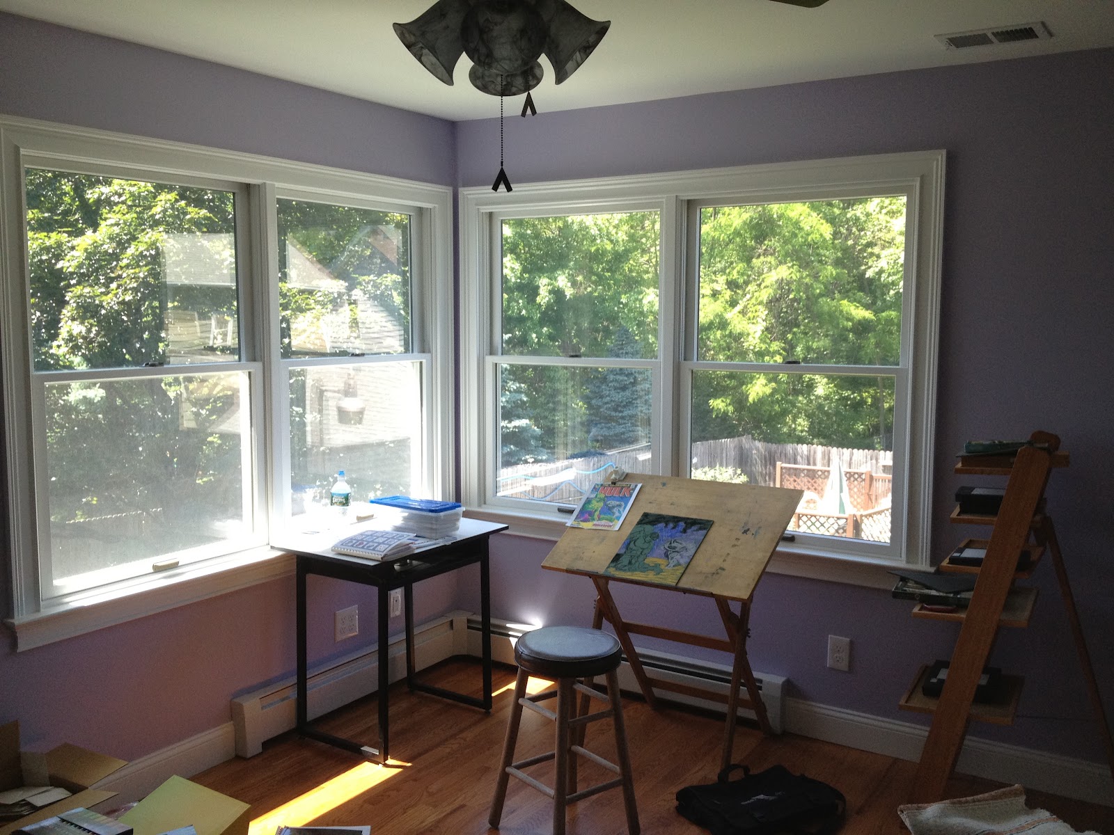
In the last post, I alluded to my new studio so I thought I would share some photos of what it looks like. It was designed to maximize the natural sunlight light. Most days I do not even need to turn on the lights to sit in there to read. My drafting table and easel sit in the corner four windows. The easel will be for mostly pastel painting and maybe, just maybe acrylic and oil paints if I ever get so inspired. The drafting table will be for pen & ink, colored pencil and watercolor.
If you look closely, you can see the beginnings of a new painting. My work travel schedule has just been plain brutal, with trips to California and the West Coast in the same week as trips to Europe (not to mention all the weekends). The net result is this painting is not as far along as I had hoped. But I have started it and that is a victory in and of itself.
This charcoal sketch took less than 10 minutes to complete but I cannot tell you how satisfying it was. I have always wanted to paint some classic Marvel covers in pastel much in the same way Alex Ross has done in oils. Thus begins the process.
I will talk more about the choice of this cover and my hopeful process in completing this painting.
Subscribe to:
Posts (Atom)